NAVIGATION REDESIGN
Services
Content Strategy, Customer Research, Content Design, Microcopy, Accessibility, Localization
Background
The bank over the years had failed to transition to a modern navigation design compared to its other major rivals. We wanted to improve the usefulness, robustness and the scalability of our navigation across all our public sites. There was clear data that showed us how our traffic on the homepage especially navigation had dropped over a 18-month period.
Strategy
We redesigned the navigation structure after:
Business partner interviews
Competitive ideation analysis
Navigation structure analysis
Design brainstorming
Competitive heuristic analysis
Exploratory usability testing
Card sorting
Content stress testing
Concept prototype testing
My role
I researched the different navigation structures available across Canadian, American, British, and Australian banks along with a few in Europe.
Then I analyzed the top navigation of identified companies to understand the structure used to organize navigation items and groupings. This was the hierarchy:
Level 1: Segment Home (e.g. Accounts)
Level 2: Category Home (e.g. Chequing Accounts)
Level 3: Category Details (e.g. Everyday Chequing Account)
After this, I helped define the main structure of the navigation menus on excel sheets and helped the UX Designer narrow down the designs of our 2 main options. I also got my hands dirty with wireframes. I mocked a couple up to help out my UXD. The UXD turned their nose up at it but I enjoyed going down into the trenches with my sleeves rolled up.
Finally, I wrote the copy for the entire nav structures. It didn’t end there.
I helped other line of businesses craft content basis what he had achieved for our day#1 release.
Before redesign
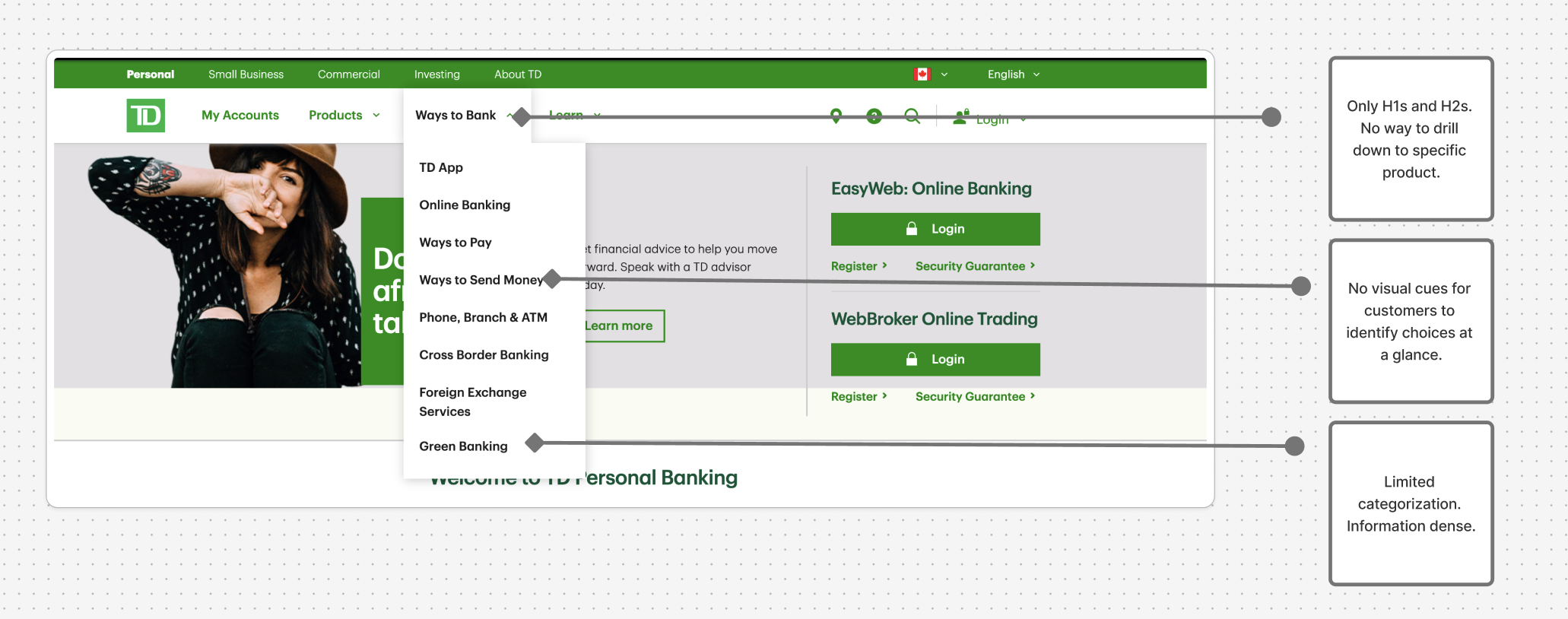
A few limitations of the previous navigation structure
The one that didn’t make it
I worked on 2 designs with the team, adding actual copy to both so that our business stakeholders could visualize what it would look like. Our research study with about 20 participants helped us narrow down the primary design choice as customers seemed to ‘analyze’ this descriptive style a lot more. I came up with all the research questions around copy.
P.S. I liked this one more as it was far more descriptive. Sadly, it was also considered more information dense.
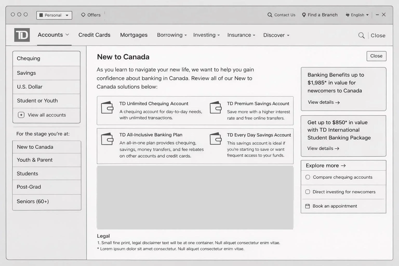
Tried so hard and got so far, but in the end…it always matters!
After redesign
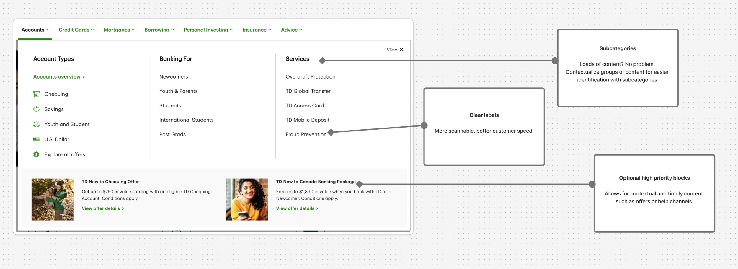
Lo and behold!
collab ftw, future ready!
We were all ears when it came to business frustration with the existing nav structure. Now our partners are dancing the days away!
All our partners got their hands dirty joining us as key allies and bringing their knowledge and expertise over to our neck of the woods.
The new design is future ready:
Sales: Integrate sales capabilities like Shopping Cart and Chat into the navigation components.
Personalization: Integrate personalized content based on audience segments to serve tailored content, increasing potential product uptake and conversion.